Don’t get me wrong here, I can totally appreciate when someone puts countless hours into building a car, and i have lots of respect for those with fabrication skills. In the end, if whoever is driving it is happy…then job well done. I try to be pretty open to new ideas and different approaches to building custom cars, but what the designer in me can’t get my head around, is lack of …design. Personally, i feel that when someone takes the of “I’ll know what it supposed to look like when it’s done.” approach without a road map, even if only a vague one, the result is often unsuccessful. Not to say the quality is bad, or that it can’t have nice details but as a whole, it falls apart.
Case and point? I came across this 40 Lincoln Zephyr online.
The car was originally a 5 window coupe that’s since been chopped, hard topped, sectioned, slammed, and modified within inches of its life, and the result kills me.
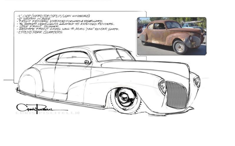
There are a host of things i could take issue with, but i figure instead of standing on a soap box, i might as well throw down some lines and thoughts of how i would approach the same project.
The idea is to start with the same car, and follow roughly the same list of modifications but still make it look cohesive as opposed to the sum of a bunch of separate features. It’s chopped, sectioned, dropped, hard topped etc, however I chose to keep the longer roofline. If you want a 3 window, start with a 3 window…or at least reference one. I was looking at Zephyrs and came across some 36 front end shots. Those lights are wild! So I figured I’d throw ‘em on in there for fun. The fenders have been extended, and the intention is to keep some of the flow and shape of the original fenders,. The front wheel wells have been massaged to work with their new shape.
As a whole, I think it could be a sweet car. That’s my two cents anyway.


No comments:
Post a Comment